Understanding Divi Breakpoints: A Complete Guide

Introduction
Divi, one of the most popular WordPress themes and page builders, provides a responsive design system that automatically adjusts your website's layout for different screen sizes. These adjustments occur at specific breakpoints, which dictate how the website elements adapt to various devices, including desktops, tablets, and smartphones.
Understanding Divi breakpoints is crucial for ensuring a seamless user experience across all devices. In this guide, we will explore what breakpoints are, how they work in Divi, and how you can customize them for better responsiveness.
What Are Divi Breakpoints?
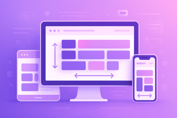
Breakpoints are predefined screen widths at which the layout of a webpage changes to accommodate different devices. Divi’s default breakpoints ensure that your website remains visually appealing and functional regardless of the device being used.
Default Divi Breakpoints
Divi has three primary breakpoints for different screen sizes:
- Desktop: Above 981px
- Tablet: 768px – 980px
- Mobile: 767px and below
Each of these breakpoints triggers specific design changes to optimize the user experience for the respective screen sizes.
How Divi Handles Responsive Design
Divi automatically applies different styles to elements based on the breakpoints. You can also manually customize these styles using Divi’s built-in responsive editing options.
1. Using the Divi Builder for Responsive Design
Divi provides options to customize settings specifically for desktop, tablet, and mobile views. You can access these options by:
- Navigating to Divi Builder
- Clicking on any module, row, or section
- Selecting the Responsive Design icon (three screen icons)
- Adjusting the settings individually for each device
2. Customizing Breakpoints with CSS
For more control, you can define custom styles using CSS media queries. Below are the standard CSS breakpoints used in Divi:
/* Tablet (768px - 980px) */
@media (max-width: 980px) {
  .your-class {
    font-size: 16px;
  }
}

/* Mobile (Below 767px) */
@media (max-width: 767px) {
  .your-class {
    font-size: 14px;
  }
}
If you want to customize Divi’s breakpoints, you can add these CSS rules in Divi > Theme Options > Custom CSS or in Appearance > Customize > Additional CSS.
3. Customizing Breakpoints with Divi Theme Builder
Divi Theme Builder allows you to set different layouts for different devices. This is particularly useful for ensuring your website looks perfect on all screen sizes.
Advanced Customization: Changing Divi’s Default Breakpoints
While Divi’s default breakpoints work well for most websites, you may need custom breakpoints for unique designs. You can modify them using CSS or by incorporating JavaScript.
Example of a custom breakpoint for larger screens:
@media (max-width: 1200px) {
  .your-class {
    font-size: 18px;
  }
}
Best Practices for Responsive Design in Divi
- Test Your Website on Multiple Devices – Use tools like Google Chrome DevTools or online platforms like BrowserStack to preview your site across different screen sizes.
- Use Flexible Units – Instead of fixed pixel values, use relative units like
em,rem,%, orvh/vwfor better scalability. - Optimize Images for Different Devices – Use Divi’s responsive image settings to display optimized images on different screens.
- Adjust Padding and Margins – Ensure adequate spacing for a clutter-free design on smaller screens.
- Hide/Show Elements Based on Devices – Use Divi’s Visibility options to show or hide elements on specific devices.
Conclusion
Divi breakpoints are essential for creating a fully responsive website. By understanding and customizing these breakpoints, you can enhance your site’s usability, aesthetics, and performance across all screen sizes. Whether you use Divi’s built-in settings, custom CSS, or advanced customization techniques, ensuring a seamless experience for users on every device is key to a successful website.
Do you have any questions or need help with custom breakpoints? Let us know in the comments!