Unlock the Power of Divi 5 Flexbox: Step-by-Step Tutorial
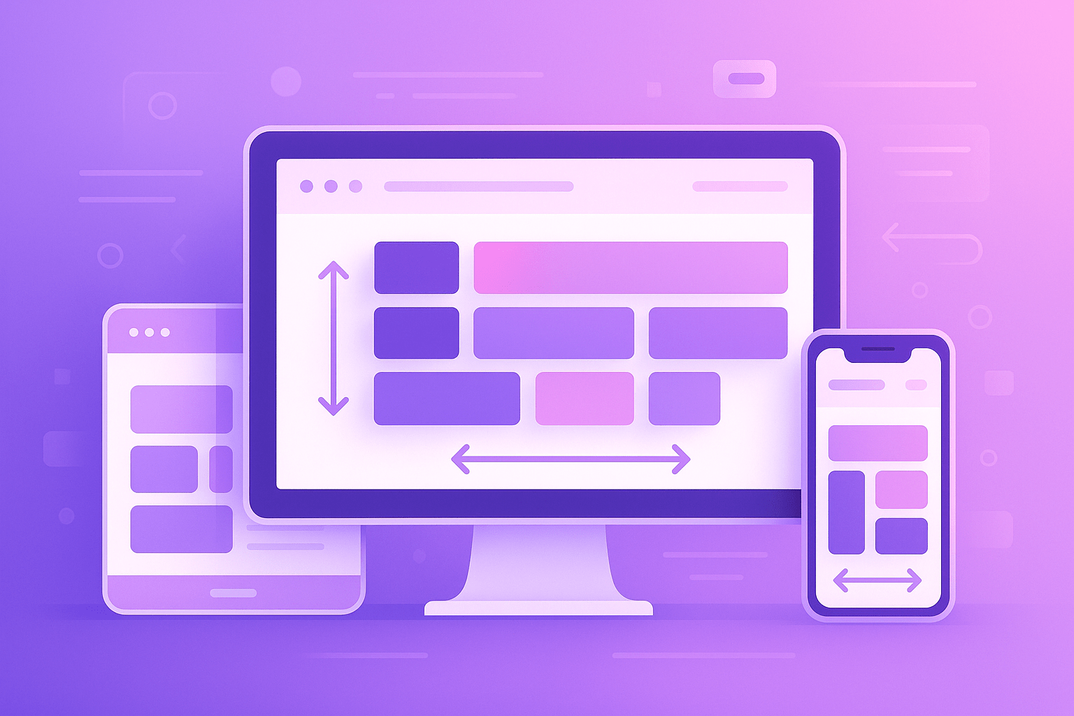
Modern web design requires flexibility, responsiveness, and clean code—and Divi 5 Flexbox delivers just that. With the release of Divi 5, Elegant Themes has introduced a powerful layout system using Flexbox, enabling users to build precise, responsive designs without writing a single line of CSS.
Whether you’re a beginner or a seasoned Divi user, this step-by-step tutorial will help you unlock the full power of Divi 5 Flexbox. We’ll walk through everything from basic concepts to practical examples so you can build sleek layouts that look amazing on every device.
🔍 What is Flexbox?
Flexbox (Flexible Box Layout) is a CSS layout module designed to distribute space along a single row or column. It makes aligning elements in a container (like rows or columns) much easier—especially when you're working with responsive designs.
In Divi 5, Flexbox is deeply integrated into the Row, Column, and Section settings, giving you intuitive visual controls to manage alignment, spacing, wrapping, and more.
🎯 Why Use Flexbox in Divi 5?
Here’s what makes Divi 5 Flexbox a game-changer:
- No custom CSS needed for most modern layouts
- More control over item alignment and spacing
- Perfect responsiveness across desktop, tablet, and mobile
- Cleaner code output for faster websites
- Supports advanced layouts like horizontal scrolling, wrapping content, and complex grids
🛠️ Getting Started with Flexbox in Divi 5
Step 1: Update to Divi 5 (Beta)
Ensure you're running Divi 5 or Divi 5 Beta. Flexbox features are only available in the latest version.
📌 Note: Divi 5 Beta is currently available for testing. Make sure you use it on a staging site before deploying to live sites.
Step 2: Enable Flex on a Row or Column
- Open a Row or Column in the Divi Builder.
- Go to the Advanced tab → Layout Settings.
- Enable “Use Flex”.
- Now you’ll see additional Flexbox settings appear:
- Direction
- Justify Content
- Align Items
- Wrap
- Gap
🧭 Understanding Flexbox Settings in Divi 5
Here’s a quick guide to the key Flex settings you’ll encounter:
1. Flex Direction
Controls the direction of items.
Row(default) – Items go left to rightColumn– Items go top to bottom
2. Justify Content
Aligns items along the main axis (horizontal in row direction).
Start– Items align to the left/topCenter– Items center-alignSpace Between / Around / Evenly– Add equal spacing between items
3. Align Items
Aligns items along the cross axis (vertical in row direction).
Start– Align to the topCenter– Vertically centeredStretch– Fill available space
4. Wrap
Lets items wrap to the next line when space runs out.
Wrap– Allows wrapping (good for responsive grids)No Wrap– Keeps all items on one line
5. Gap
Sets the spacing between items—a great alternative to padding/margin hacks.
✅ Practical Examples with Divi 5 Flexbox
Let’s put theory into action with real examples.
🔸 Example 1: Centered Button Row
Goal: Display 3 buttons side-by-side, perfectly centered with spacing.
Steps:
- Add a Row with one column.
- Add three Button Modules inside the column.
- Open Column settings → Enable Use Flex.
- Set:
- Direction: Row
- Justify Content: Center
- Align Items: Center
- Gap: 20px
Result: A clean, centered row of buttons with even spacing.
🔸 Example 2: Responsive Icon Grid
Goal: Create an icon grid that automatically wraps on smaller screens.
Steps:
- Add a Row and insert 6 Blurb Modules.
- Open Row settings → Enable Use Flex.
- Set:
- Direction: Row
- Wrap: Wrap
- Gap: 30px
- Justify Content: Center or Start
Result: A flexible grid that adjusts automatically across devices.
🔸 Example 3: Sidebar + Content Split Layout
Goal: Show sidebar on the left and content on the right.
Steps:
- Use a Row with two columns.
- Place your sidebar modules in column 1 and content modules in column 2.
- Enable Flex in the row.
- Set:
- Direction: Row
- Align Items: Stretch (so both columns are equal height)
Tip: You can reverse columns for mobile by adjusting Flex Direction to Column and using Order settings in each column.
🔄 Making Layouts Responsive with Flexbox
Divi 5 lets you adjust Flex settings per device:
- Just click the responsive icon next to any setting (like
Justify Content) and adjust it for desktop, tablet, and mobile. - You can even use Order settings to rearrange elements for mobile (great for moving CTAs above other sections).
🧩 Bonus Tips & Tricks
- Use Align Self inside module settings for individual alignment tweaks.
- Combine Flex Direction: Column with
Justify Content: Centerfor perfect vertical alignment. - For equal-height cards: Use Align Items: Stretch on the parent row or column.
🔐 Why Switch to Divi 5 Flexbox?
Here’s a summary of why Divi 5 Flexbox is a must-use tool:
✅ Cleaner and faster design workflows
✅ No CSS or spacing hacks required
✅ Fully responsive by default
✅ Greater layout control
✅ Easier to maintain and scale
✅ Future-proof — aligns with modern CSS practices
🚀 Final Thoughts
Divi 5 Flexbox isn’t just a small update—it’s a total design upgrade. Whether you're building a personal blog, an agency website, or a sales page, using Flexbox will make your layouts more powerful, flexible, and responsive.
By following this step-by-step tutorial, you’ll not only understand how Flexbox works in Divi 5, but also gain the skills to build advanced designs in less time—without a single line of code.
📘 Additional Resources
- Divi 5 Beta: Official Docs by Elegant Themes
- Divi Layouts at DiviHat.com
- [Free Divi Flexbox Templates (Coming Soon on DiviHat)]
